I have given these tutorials earlier but I think a reminder will need for newbies. So here are they and I got some useful stuff just for you.
Every web designer has a secret or two. Hard-won workflows, hidden hacks, and insider knowledge that are the mark of true experience and the stuff that separates great web design trainingfrom good.
Here, we've managed to persuade some of the web's busiest devs and designers to part with their most closely guarded tricks and tips. It's quite a collection.
Packed with professional know-how, you'll discover secret features of well known tools, the beta services that the design industry is buzzing about and CSS tricks that make page design for multiple platforms easy. So whether you're a beginner at online design or a web veteran, you're bound to uncover one or two tips here that will change the way you work.
Faster coding
01. CodeKit for browser reloading
CodeKit enables you to instantly see changes in your browser, without refreshing
"If you're on a Mac then CodeKit is a must," says Keir Whitaker, co-founder of Viewport Industries. "The browser reloading feature is worth the small cost alone. The days of hard refreshing your browser to make changes take effect are long gone."
02. Apply global changes
Here's a coding tip from musician, producer and web dev Elliott Fienberg that can help speed things up at the early stages of your design work. Use the wildcard CSS rule - using an asterisk as the selector - and you can globally apply changes to an entire page. For example, to change all the fonts on a page to sans-serif, you just need: *{font-family:arial, helvetica, sans-serif;}
This is a great designer's trick to have in your pocket while you're going through the design process. Of course, it's not such a great idea to leave it in your live code, so use this trick carefully and sparingly!
03. Set garish outlines
File this in the "simple acts of genius" folder - a tip from Christopher Murphy of Web Standardistas that makes cross-platform design so much easier. "When working with media queries, set an outline in a garish colour," says Murphy. "For example: {outline:10px solid green/red/yellow/blue;}. This enables you to instantly see which exact rules are being applied to what you're currently looking at."
04. Check your character count
"45-75 characters per line is generally accepted as safe for comfortable reading," says Trent Walton, founder and designer with Paravel. "There's a quick trick to ensure your responsive or fluid design supports this. Place a line of dummy text on your page with an asterisk at character 45 and an asterisk at character 75. Now test the site to make sure it resizes within these parameters."
05. Use FitVids for video embedding
HTML5 has simplified video embedding, but designers still have two problems. The first is getting video to resize responsively, the second is to ensure resizing degrades gracefully for Flash when HTML5 embedding isn't supported. Enter FitVids, a jQuery plugin that takes care of all that for you.
Dealing with images
06. Smushit for image size reduction
Smushit uses optimisation techniques to remove unnecessary bytes from image files
Sites with highly optimised images load faster and work better on more devices. "SmushIt is a great option to reduce image file sizes," says web developer and Microsoft evangelist Martin Beeby, and we agree. You may also want to give Trent Walton's fave ImageOptim a try.
07. Export images as 8bit PNG
Martin Beeby makes an old-school suggestion for handling PNG image files. "If you're exporting an image from Photoshop to PNG, and it doesn't need to be transparent, try exporting it as an 8bit PNG," he explains. "In most cases the image quality won't be affected but you will massively reduce the file size."
08. PNGQuant for image conversion
If you want to maintain transparency and minimise file size, there's a service that can help. PNGQuant can convert 24/32bit PNGs to 8bit PNGS and still maintain transparency. There's fancy for you.
Layouts
09. Use GuideGuide
GuideGuide is a columns, rows, and midpoints panel for Photoshop
"The best websites are designed to a grid," says Rhys Little, director of digital marketing agency Plug and Play. Setting up grids everytime in Photoshop can be tedious, though. He recommends Guide Guide: "It makes the process a breeze and save you a lot of time creating custom grids."
10. Use a 12-column grid
Another tip from Rhys Little: "Typically it is a good idea to use a grid with columns nicely divisible by 2, 3 and 4. Therefore, a 12 column grid is one of the most popular and versatile grids to use." Check out 960grid for more web design-friendly grid templates for a host of apps.
11. Find colour inspiration
We’re already fans of Adobe Kuler; Martin Beeby has uncovered a use we hadn't thought of: "I'm colour blind and so when I'm putting colour palettes together for a project I always reach for Kuler," he explains. He also recommends Colour Lovers - a creative community where members share colour schemes, designs and ideas.
Web typography
12. Typecast for typographic palettes
Typecast helps you build up a typographic palette quickly
Typecast, an app produced by the talented team at Belfast-based design agency Front, makes designing typographically rich sites a breeze. "It enables you to rapidly build and compare typographic palettes," enthuses Christopher Murphy.
13. Use Typecast with Google Fonts
Monotype recently teamed up with Google to release a new, free public version of Typecast which can be accessed throughGoogle Fonts. It enables you to select any font on the Google Fonts website and then follow the link to the Typecast app.
From there, you can work with that font on text of any length and use a wide range of type controls to build clear, readable type systems through adjustments such as font size, weight and line spacing. Your work can be exported as production-ready HTML and CSS, or PNG files, to share with others or merge with comps.
14. Font Squirrel for free web fonts
Free web fonts have really come of age. With Font Squirrel,Google Web Fonts and the @font-face attribute of CSS3, there's no need to put up with the typography troubles the last generation of web designers struggled so much with. Here's our round up of some of the best free web fonts around.
Plan the perfect site
15 Use Dropbox for version control
Dropbox Pro can be used as a simple versioning system
Keir Whitaker suggests using Dropbox Pro as a simple versioning system. As well as having 100GB of storage, you'll get versioning of your files for 30 days rolling. "More than enough to help you out with those 'accidental' deletes," says Whitaker.
16. Slow down
Visual creatives have a habit of whipping out their sketchbook first. Aidan Martin, senior designer at Alienation Digital, says we all need to slow down. "Don't start with a design: take a scenario-based approach," says Aidan. "Firmly establish the user's goals, map out their journey and then build the design around this."
17. Put your site on a Post-it
Does your design idea fit on a Post-it note, asks Elliott Fienberg? "One exercise I like to do is to write down your core content on a small piece of paper like a Post-it note," he says. "This will help you figure out what is really important and what can be omitted. The small piece of paper simulates the attention span of most users these days."
18. Plan your user flow
Want to know what to do with the rest of those Post-its? "You can expand this exercise by planning out your user flow on a series of Post-it notes," adds Elliott Fienberg. "I guarantee your project will be far more focused." Other sticky notes are available, of course, including virtual Sticky Notes on Windowsand Stickies on OS X.
Photoshop workflow
19. Name your layers wisely
Be as descriptive as possible when naming your Photoshop layers
Rhys Little offers a clutch of tips on sharing Photoshop layouts within your team. His first suggestion: "Be as descriptive as possible when you name your Photoshop layers. It takes a second when creating a new layer to give it a simple name that others will be able to understand. This will save hours of forensic work later on."
20. Bin spare layers
Throw away any extra layers in Photoshop designs, adds Rhys Little. "If you like to save those extra layers 'just in case' then just archive a version with the layers you want to save," he says. Your main file will only contain the layers developers and other designers need access to, minimising confusion.
21. Label your folders
"Make sure you create an ASSETS Folder containing all fonts, images, logos, etc used in your project," continues Rhys Little. "And ensure that those individual folders are labelled accordingly."
22. Keep names consistent
Rhys Little also suggests that you maintain a consistent naming scheme, where the current site design file is always has the same name, rather than incrementally naming files. Older files should then be banished to an archive folder. For example: ARCHIVE WEBSITE.PSD
23. Save everything to server
"Remember to save your work to the server," adds Rhys Little. Even when you're taking an afternoon to tweak a file; "if you are sharing files, you need to ensure that your most recent work is readily available even if you are not."
Keep clients happy
24. Use Pinterest for moodboards
Pinterest is a great way to get started collaborating on moodboards with your client
While we’re talking about keeping clients on your side, we all know that clients love moodboards. They’re a great way to collect elements together quickly and clue your client in - or even get them involved in the initial design process. The easiest way to get started? Create a shared board on Pinterest and invite your client to pin away.
25. Involve clients from the start
"Get the client involved as early as possible and throughout the design process," says Aidan Martin. "Always remember that they know their business best and only by combining this knowledge with your own will you be able to develop a truly successful digital solution."
26. Focus on prototyping
Use prototyping tools to get early versions of your designs in front of clients as soon as possible. This could be as simple as a Fireworks prototype or as complex as a functioning wireframe made in Balsamiq. "Get those signed off before jumping in with Photoshop and it will make your job a lot easier," urges freelance web designer Gavin Elliott.
Boost your career
27. Ask for help
Use a free collaboration tool such as Trello to ask for help when you get stuck
If a job calls for an advanced skill you don't yet have, don't be afraid to ask for help. With free collaboration tools like Trelloand Redbooth you don't even need to be in the same country!
28. Work on your portfolio during downtime
"Don't wait for other people to ask you to try something new or to challenge you," says Ben Howdle, developer at Wapple.net. "In the downtime between jobs, when you’ve finished pitching, you should always be creating new portfolio work. The more inventive, the better."
29. Say yes to new challenges
Ben Howdle has another strategy for keeping the work flowing: say yes to work even if it's outside your comfort zone. "Taking on jobs that challenge you helps you to develop and expand your skills much more than any tutorial. And deadlines are a powerful motivator to learn on the job."
30. Get feedback from Dribbble
Remember how helpful those crit sessions were at college? "Check places like Dribbble for inspiration," urges Ben Howdle. It's a social network for designers, where you can share work in progress and get comments from your peers. Sometimes it takes another designer to tell you where you're going wrong - or right.
Get the Web designing tutorials here:....................
A projection keyboard is a form of computer input device whereby the image of a virtual keyboard is projected onto a surface: when a user touches the surface covered by an image of a key, the device records the corresponding keystroke.
An optical virtual keyboard was invented and patented by IBM engineers in 1992. It optically detects and analyses human hand and finger motions and interprets them as operations on a physically non-existent input device like a surface with painted or projected keys. In that way it can emulate unlimited types of manually operated input devices (such as a mouse, keyboard, and other devices). Mechanical input units can be replaced by such virtual devices, potentially optimized for a specific application and for the user's physiology, maintaining speed, simplicity and unambiguity of manual data input.
In 2002, start-up company Canesta developed a projection keyboard using their proprietary "electronic perception technology". The company subsequently licensed the technology to Celluon of Korea.
A proposed system called the P-ISM combines the technology with a small video projector to create a portable computer the size of a fountain pen.
A laser or beamer projects visible virtual keyboard onto level surface. A sensor or camera in the projector picks up finger movements Software converts the coordinates to identify actions or characters.
Some devices project a second (invisible infrared) beam above the virtual keyboard. The user's finger makes a keystroke on the virtual keyboard. This breaks the infrared beam and reflects light back to the projector. The reflected beam passes through an infrared filter to the camera. The camera photographs the angle of incoming infrared light. The sensor chip determines where infrared beam was broken. Software determines the action or character to be generated.
The projection is realized in four main steps and via three modules: projection module, sensor module and illumination module. The main devices and technologies used to project the image are a diffractive optical element, red laser diode, CMOS sensor chip and an infrared (IR) laser diode.
Projection keyboards connect to the computer either through Bluetooth or USB.
Bluetooth dongle technology enables the projection keyboard for point to multi-point connectivity with other Bluetooth devices, such as PCs, PDAs and mobile phone.
How the Bluetooth projection keyboard connects to devices depends on the specific tablet, phone or computer.
The connection between the USB keyboard and the device is made through a USB port, which is available on every computer and (via an adapter) other devices.
Apart from simply being used to type, most laser keyboard systems can function as a virtual mouse or even as a virtual piano.
Copyrighted by: http://en.wikipedia.org/wiki/Projection_keyboard
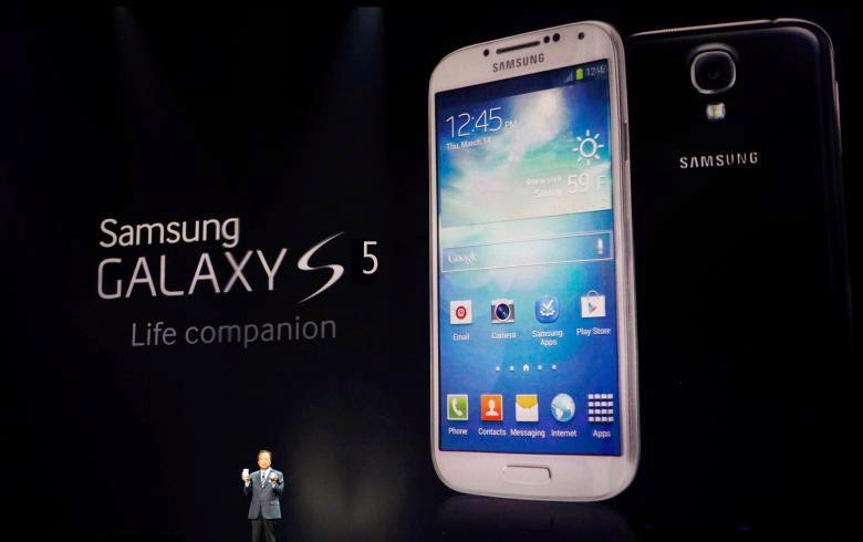
The Samsung Galaxy S5 is an Android smartphone produced by Samsung Electronics, which serves as the immediate successor to 2013's Galaxy S4. Unveiled on February 24, 2014 at Mobile World Congress in Barcelona, Spain, it was released on April 11, 2014.
As with the S4, the S5 is an evolution of the prior year's model, placing a particular emphasis on an improved build quality, dust and water resistance, a more refined user experience, new security features such as a fingerprint reader, and an updated camera.
Hardware and design
The design of the S5 evolves upon the design of the S4, with a rounded, polycarbonate chassis carrying a "modern glam" look, faux metal trim, and a removable rear cover. Unlike past models, the S5's rear cover uses a higher quality soft plastic, and is dimpled to improve grip. The S5 is IP67 certified for dust resistance, and for water resistance in up to 1 metre (3.3 ft) of water for up to 30 minutes; as such, the S5's Micro-USB 3.0 port now uses a removable cover. The S5 will be available in black, blue, gold, and white color finishes. The S5's screen is a 5.1-inch (130 mm) 1080p Super AMOLED panel, which is slightly larger than that of the S4, and allows for automatic brightness and gamut adjustments.
Below the screen are three buttons. The physical "Home" button in the centre contains a swipe-based fingerprint reader. The "Recent apps" and "Back" buttons are capacitive. In accordance with Android 4.0 human interface guidelines, the S5 no longer uses a "Menu" key like its predecessors, although its button layout is still reversed in comparison to other Android devices with the S5's button layout (such as the HTC One X and Galaxy Nexus, whose "Back" buttons are to the left of "Home").
The S5 includes a 16 megapixel rear-facing camera, which offers 4K video recording, phase detection autofocus (which can focus in around 0.3 seconds),[4] real-time HDR photos and video, and an image sensor with Samsung's "Isocell" technology, which isolates the individual pixels inside the sensor to improve its ability to capture light. Next to the camera's flash on the rear of the device is a heart rate sensor, which can be used as part of the S Health software.
The S5 is powered by a 2.5 GHz quad-core Snapdragon 801 system-on-chip with 2 GB of RAM. Although not mentioned during the keynote presentation, a variant with an octo-core Exynos 5422 system-on-chip will also be released in unspecified markets. Like the previous model, it uses two banks of four cores; four Cortex-A7 cores at 1.5 GHz, and four Cortex-A15 cores at 2.2 GHz. Depending on resource usage, the SoC can use the power-efficient A7 cores for lighter processing loads, and switch to the A15 cores for more demanding loads. Unlike previous iterations, however, the 5422 can run both sets of cores at the same time instead of only one at a time. For connectivity, it supports 802.11ac MIMO Wi-Fi and LTE.
The S5 contains a 2800 mAh battery; its software also contains an "Ultra Power Saving" mode to further extend battery life; when enabled, all non-essential processes are disabled, and the screen switches to only rendering in white on black. Samsung claims that with Ultra Power Saving on, an S5 with 10% charge remaining can last for an additional 24 hours in standby mode.
Software
The S5 ships with Android 4.4.2 "KitKat" and Samsung's TouchWiz software. Unlike TouchWiz on the S4, the S5's TouchWiz has been given a more refined interface, although certain aspects of the changes were influenced by a recent patent licensing deal with Google, which requires that Samsung's TouchWiz interface follow the design of "stock" Android closer. The S5 adds the Galaxy Note 3's "My Magazine" feature to the leftmost page on the home screen, the Settings menu was updated with a new grid-based layout, a Kids' Mode was added, the "Download Booster" tool allows large downloads to be split across LTE and Wi-Fi to improve speed, while the S Health app was given expanded functionality, integrating with the new heart rate sensor on the device, along with the new Gear 2 smartwatch and Gear Fit activity tracker.
The S5 contains a number of new security features. The fingerprint scanner can be used to unlock the phone, while an SDK is available so third-party developers may offer fingerprint-oriented functionality in their apps; PayPal will integrate support for the fingerprint sensor to authenticate online purchases. The S5 also adds "Private Mode", which allows users to maintain hidden apps and file folders that cannot be accessed without additional authentication. The camera app was updated with a new "Shot & More" menu that allows users to make edits to photos after they are taken, and also adds a new selective focus mode. Samsung has rolled out a minor update on 10th April 2014, one day before the worldwide launch to improve the phone's stability.
Copyrighted by Wikipedia (http://en.wikipedia.org/wiki/Samsung_Galaxy_S5)
Learn how to capture screenshots of your mobile phones and tablets and then make these captured images look more awesome and photorealistic.
It’s easy to capture screenshots on mobile devices but let’s do a quick recap. If you have an iPhone, press the Home & Sleep buttons and the screenshot image will be saved instantly. On an Android device, press the Volume Down & Power button simultaneously to capture whatever is currently on your screen. And in the case of Windows Phone 8, press and hold the Start and Power buttons at the same time to take a screenshot.
That’s a raw screenshot saved in your camera roll but you also need to add the hardware frame around your screenshots so that the captured images appear more realistic and provides better context to the viewer.
Why is that important? A 768 pixels wide screenshot of a mobile app in portrait mode could have been captured on an Android device or an old iPad – now wrap that same image inside the Google Nexus frame and everyone is saved from playing a guessing game.
A layered photo editing tool like Adobe Photoshop makes it really easy for you to add hardware device frames to any screenshot image. Go to Dribbble and search for “freebies PSD ” and you’ll find beautiful mockups for that mobile device.
Download and import the PSD file into Photoshop and then use the File -> Place command to place the screenshot image as a new layer over the mockup. Use the Save for Web option to export the screen capture in JPEG format.
[*] Dribbble users usually add the tag “freebies” or “free” to indicate that others can reuse their design(s) for personal and commercial use. Other than Dribbble, Deviant Art and Behance are also good places to discover high-quality mobile mockups.
If you aren’t well-versed in Photoshop, you can make use of a web app like PlaceIt that will automatically add device frames to your mobile screenshots.
The tool offers a collection of professional-quality photographs of mobile phones and tablets placed in realistic settings. You need to drag your screenshot image onto a photograph and it will automatically get placed in the screen area of the mobile device perfectly aligned with the hardware frame.
PlaceIt can handle screenshots of your iPhone, iPad, Nokia Lumia, Macbook, Microsoft Surface, iMac, Amazon Kindle, Samsung Galaxy and Google Nexus phones.
Also see: Screen Capture Full Web Pages on your Mobile
The Device Art Generator, available here and here, is provided by Google for anyone to quickly add device frames around screenshots of Android phones and tablets.
Drag the mobile screenshot image on to a device frame and it will quickly wrap that frame around your image. You also have the option to add screen glare and depth (for perspective) to the generated screenshots.
Device Art Generator includes templates for HTC One X, Samsung Galaxy S3, Galaxy Note, Galaxy Tab, Nexus 4, Nexus 7 and Google Nexus 10 devices.
MockuPhone is another useful web app for adding device frames to your mobile screenshots with a unique feature. You pick a device frame, upload the mobile screenshot image and the tool will generate multiple screenshot images of the same device but at different angles.
The tool produces very high-resolution screenshots and they offer device frames for the iPhone 5, iPad & iPad Mini, Google Nexus and Samsung Galaxy S4.
You can also add realistic device frames to your mobile screenshots via email. Just send the raw screenshot image as an email attachment to smartphones@mailchimp.com and, within in a minute or two, they will send you the processed screenshot with the device frame. You can also send multiple screenshots in the same message.
The service will automatically detects the mobile device name and the image orientation (portrait or landscape) using the EXIF data in the image and adds the appropriate hardware frame. It supports iPhone, iPad, Galaxy Tab, Nexus and a bunch of mobile device – send an email with the subject “help” to the same address for a complete list.